Gallery
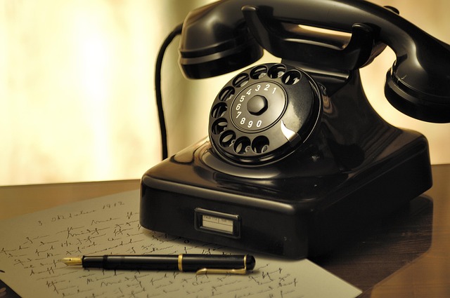
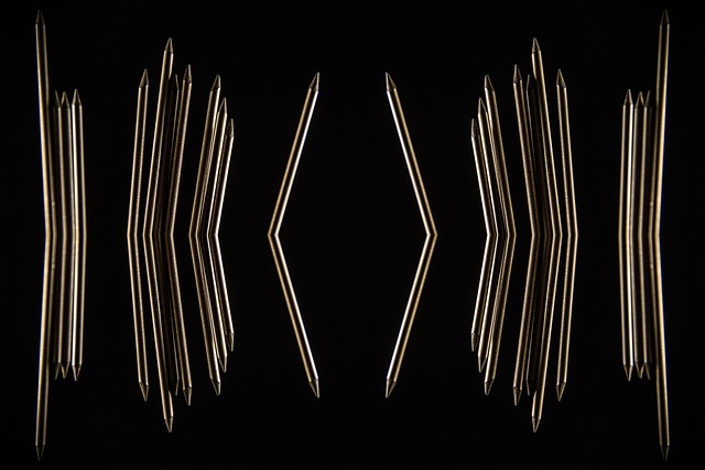
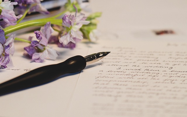
Compare writing textures, tool shapes, and desk setups in one place. Each image is a unique illustration to help you notice details: nib angle, pencil point geometry, paper tone, and how a practice page is arranged.
How to use this gallery
- Pick one category and look for repeatable patterns, such as consistent slant or spacing.
- Use the images as prompts for practice: copy a headline layout, then adjust one variable (pressure, speed, or line height).
- Match tools to paper: smooth nibs on coated paper, textured pencil strokes on toothier sheets.
Primary themes
Pens, pencils, paper, lettering, and desk routines
These visuals support the same neutral learning approach as the guides: technique notes, observable differences, and practical practice cues.
What you will notice
Surface, contrast, and rhythm
Look for line variation in ink, graphite sheen, and the spacing that makes a page feel calm and readable.
Related pages
Guides and tools
If an image raises a question, use the guide index to find a matching topic or the tool page for neutral selection notes.
Writing instruments
Fountain pens, mechanical pencils, wooden pencils, and nib holders shown in simple studio layouts. Use these images to compare form factor and handling.
Ink, paper, and practice sheets
Page surfaces change how writing looks and feels. These images highlight dry time, feathering risk, and the clarity of letter edges.
Desk setups and studio routines
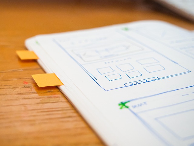
Small environmental choices can make practice easier: lighting, page angle, tool placement, and a clear “start here” space.
Practice prompt you can try today
Pick any one image above and write a single sentence twice. First pass: slow and careful, focusing on spacing. Second pass: slightly faster while keeping the same letter height. If your writing changes, note what shifted: pressure, slant, or baseline drift. Then choose one adjustment to repeat tomorrow.
Contact
Send a question about handwriting practice, tools, or learning paths. We reply in English.
Company
GHF Beheer B.V.
Wilhelminastraat 62, 8561 AD Balk, Netherlands
Phone
+31 85 130 6482
Available on business days (Central European Time)
What to include in your message
- What you write most often: notes, journaling, forms, or lettering.
- The tool you use: ballpoint, gel pen, fountain pen, wooden pencil, or mechanical pencil.
- The main constraint: speed, hand fatigue, inconsistent size, or messy spacing.
- A simple goal for the next two weeks, such as “cleaner headings” or “more readable cursive joins.”
Privacy and consent
If you contact us, we use your information only to respond to your request. Details are explained in our Privacy Policy.